Google Material Design – What Is It? Explained
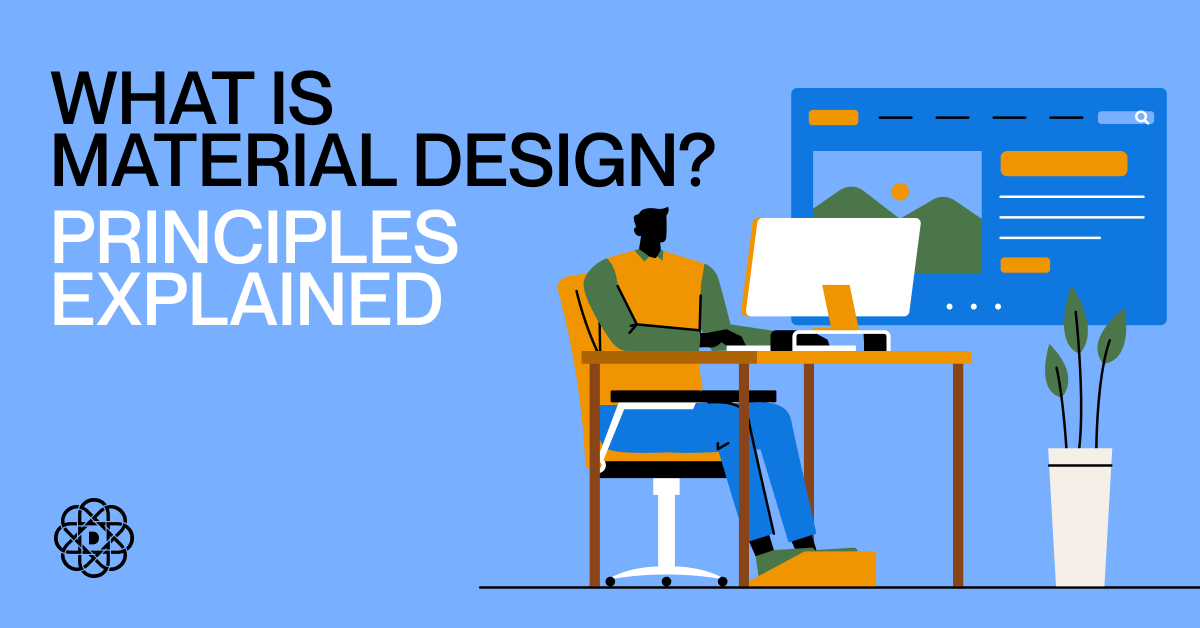
What is Material Design? It’s a design system created by Google. Its aim is to build better digital experiences by embracing the physical world. This design system uses colors and shades to underline and differentiate elements and comes with many resources that you can use and customize. Do you want to learn more? Then read on.
What Is Material Design?
Google Material Design, first introduced in 2014, is an open-source design system that can be applied to various environments, including:
- Android,
- iOS,
- Flutter,
- web.
It was inspired by paper and ink, along with the general principles of the physical world, for instance the way how light is reflected. Material Design comes with a plethora of ready resources, but its main advantage is that you can customize and change them – it’s not just a library, but a whole system.
The main principle of Material Design is to create two-dimensional UIs that look as if they were painted on a sheet of paper and looked on from above. Thus, while the elements are indeed 2D, they still have shadows that make them look a little bit less flat.
The Principles of Material Design
Google Material Design thrives on user-centered solutions. Hence, similarly to general UX design, it has several basic principles that you should follow when creating digital products in this system. Let’s look at them now.
Understanding the “Material”
The name is no coincidence, but you really need to understand what “material” is if you want to embrace this design system. While it is indeed inspired by physical objects, Material Design embraces generalization. Why? If the real-world materials were reflected too thoroughly, they would become too overwhelming for the users, hence not in line with the usability and user-centricity UX principles.
This also means our human approach to materials in real life. For instance, when you imagine a piece of paper, you know what it feels like to touch it, what color it is, and what sound it makes. The same goes for the UI – the principle of Material Design is to create user interfaces that are intuitive, hierarchical, and easy-to-use; UIs that are like physical materials, where the user knows exactly what to expect.
Hierarchy
As mentioned above, hierarchy is a crucial element of Google Material Design. In this case, it is achieved through colors. This is done in two ways:
- Shades and shadows – used to create a hierarchy of similar elements.
- Different colors – used to differentiate varying elements by creating contrast.
Bold Colors
Since we’ve mentioned the hierarchy of elements, we must discuss colors in a bit more detail. Material Design principles include using bold, depictive, and purposeful colors. Why?
In general, Material Design is minimalistic – the elements are unsophisticated. Hence, since UI objects aren’t that diverse, colors are used to highlight the most important elements and guide the user. Thus, you shouldn’t be afraid to create a bold contrast and use a wide range of different colors; on the contrary, you should embrace this approach.
White Space
Bold colors are crucial, but at the same time, you should embrace white spaces. They are the best way to let the user rest from the overabundance of content and the perfect tool to divide the objects.
Animations
Simple as it may seem, you can use additional, interactive elements like animations in Material Design. However, you should still keep them pretty basic and stick to the paper sheet metaphor.
For example, you can opt for short animations after clicking a button. This way, you don’t only enrich the UI design but also the UX by giving the user feedback on their actions.
Why Use Material Design?
Finally, let’s discuss why using Material Design is an excellent option. While there is a difference between UI and UX design, and this language focuses mainly on the former, it also comes with a plethora of benefits for the latter. Let’s look at all the benefits.
- Prepared guidelines and resources – Google Material Design solves a lot of UX issues, and comes with a comprehensive set of guidelines and resources, ensuring that your website will be user-friendly.
- Focus on mobile users – Material Design adopts the mobile-first approach, ensuring that your product fits into the current trend of surfing the web via mobile devices.
- Speed – Due to the vast library of resources and knowledge, designing a product through this system is quick when compared to other methodologies.
- Cost-effectiveness – By opting for this Google design system, you reduce costs on various levels – from saving on the time required to create the product to decreasing the price of designing the graphical elements.
- Performance – Due to its simplicity, this system enables you to create products that are quick and effective, hence building a positive user experience and driving conversions.
Remember About Material Design!
What is Material design, and why should you use it? It’s a system designed by Google to create captivating 2D digital designs that resemble physical materials. Since it’s user-centered and mobile-oriented, we encourage you to apply it when creating your digital products. And if you need help with that, check out our web design and web development services.
You might also read: 12 Basic Homepage Design Tips for Successful Creative Web Development
Author