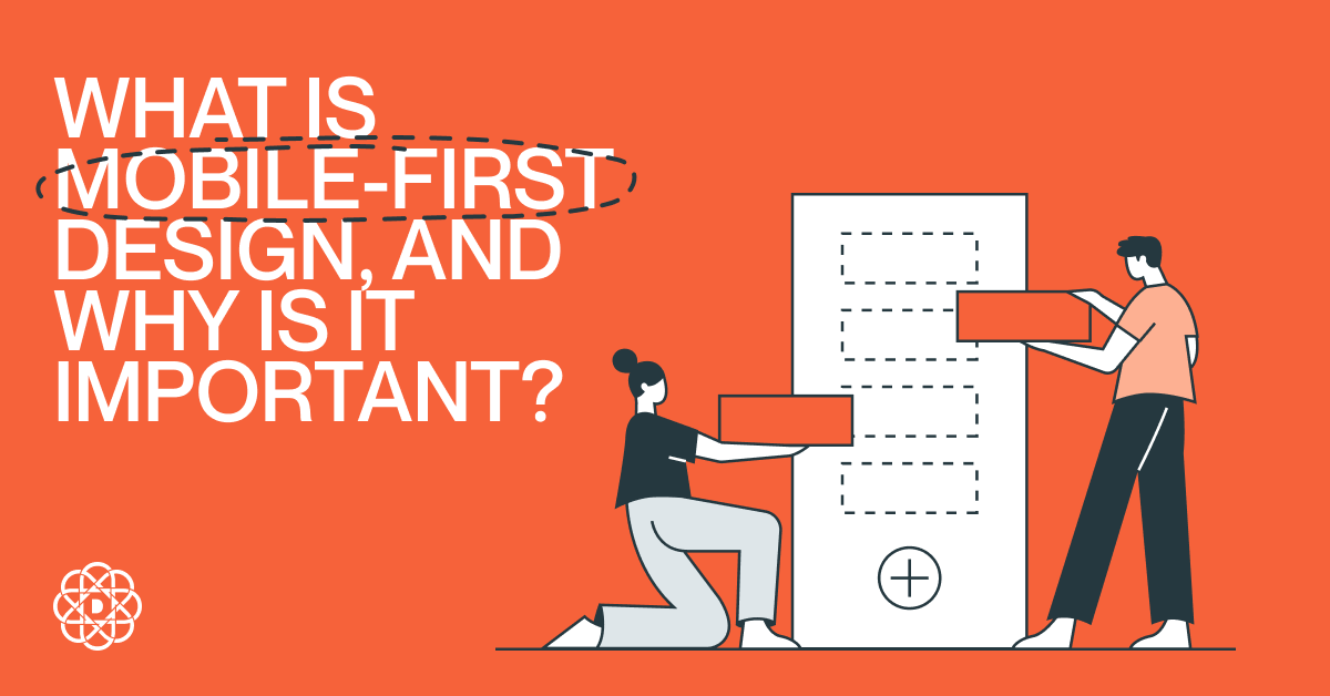
Mobile-First Design – Responsive Approach
What is mobile-first design? It’s an approach in which developers begin product design from the mobile version. Is it a good approach? Yes – according to Datareportal, 96.5% of internet users globally access the web through mobile phones, while only 61.8% do so through laptops and desktops. Do you want to learn more? Then read on!
What Is Mobile-First Design?
Mobile-first design, also known as mobile-first approach, is the method in which developers prioritize the mobile version of their digital product over the desktop one. Thanks to this, the developers can ensure that all elements of the product fit into its mobile version – in the opposite, desktop-first design, some parts of websites or apps often fail to scale correctly or are impossible to convert to mobile-friendly versions. Mobile-first design is all about proper UX and UI design. The goal here is simple: since more users use mobile devices to access the web, the user experience must be highly positive for those surfing the net on their phones and tablets; hence, it should be prioritized.
Why Is Mobile-First Design Important?
As we mentioned in the introduction, according to the Datareportal, about 96.5% of internet users surf using their mobile phones, while only 61.8% do this using laptops or desktops. Thus, naturally, the websites should be adjusted to the majority. However, you can still start with a desktop-first design and then remold the product to fit the mobile devices, right? Not exactly. Scaling down to smaller screens is much more tricky than scaling up to larger ones. Therefore, when adopting the desktop-first approach, the developers might come across obstacles that wouldn’t appear if the process was carried out the other way around. But it’s not the developers that need to be wary. When you start from the desktop when filling your site with content, you might design a layout that will be visually appealing to computer users but completely unintuitive to mobile users. Take, for instance, text wraps. If you want to design a two-column site, where one side contains a photo and the other text, you need to consider how you place the content with the wraps in mind. While it will always look as intended on desktops, it will be different for mobile phones as their screens are too narrow to display the two columns next to each other. So, if you’re starting from the desktop, you need to consider how the content is wrapped to avoid displaying two boxes of text one after the other (or a layout: text 1 – photo 1 – photo 2 – text 2). If you start from the mobile version, this problem will not occur.
The Principles of Mobile-First Design
Like in the case of UX design principles, there are some general best practices that should be followed when designing a digital product with the mobile-first approach. How should you do this?
Think Like a Mobile User
As users, we have slightly different expectations towards desktop and mobile versions of a website. Thus, you need to start your mobile-first design strategy by understanding what the user expects from you. For example, imagine you’re working on a website of a gym. What will a desktop user look for when entering your website? Probably the equipment you have and your prices. On the other hand, a mobile user will most likely try to check out the location or opening hours. You need to think like the mobile users and create a content hierarchy accordingly.
Navigation
Secondly, you need to focus on how the user will navigate your website. As mobile devices can display fewer elements, you need to keep it simple but intuitive and as useful as in a desktop version. Here, you have to consider different types of devices and people. For instance, some people may use thumbs, and others their pointing fingers, so you need to design buttons that are large enough to be easily tappable.
Optimize Your Content
You also need to look into your content and make sure it fits the mobile environment. What do we mean in practice? For instance, adjusting photo sizes to avoid awkward cuts that could impact user experience.
Mobile-First Responsive Design – Is It Always the Best Choice?
Is mobile-first design always the perfect choice? No. There are some cases in which you are much more likely to experience traffic, mainly from desktop users. For example, desktops are most commonly used at work. If you offer services and content that are targeted at businesses actively searching for organizations like yours, it might be better to adopt a desktop-first design rather than a mobile-first approach. Here, it’s good to know your industry – perhaps there are some statistics that could tell you whether you should expect mostly mobile or desktop traffic?
The Takeaway
Prioritizing your approach based on who will access them is crucial when creating digital products. Whether you choose the mobile-first design or the desktop-first design, you need to make an informed decision – based on the data on the trends in your target market. If you feel that you need help with your mobile app or site design, feel free to contact us – at Digital Present, we will provide you with the finest digital product design services available!
You may also read: Indicators that Your Business Needs a Website Redesign
Sources: https://datareportal.com/reports/digital-2024-global-overview-report
Author