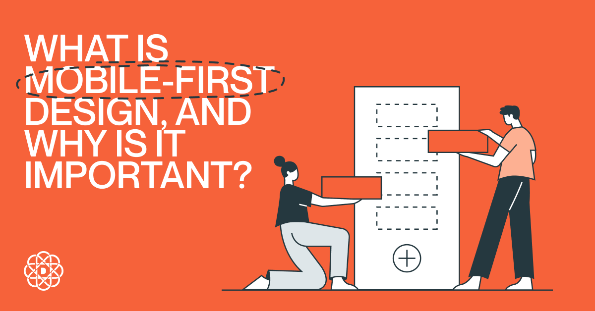
Mobile First Design
Mobile first design puts the smallest screens and fastest paths to value at the center of your product decisions. By prioritizing essential content, touch-friendly UI, performance, and progressive enhancement, you create a mobile first responsive design that scales gracefully to tablet and desktop without bloat or rework.
Why mobile first is still relevant
Most web sessions now start on phones, search engines index primarily from the mobile view, and modern buyers expect near-instant interaction on the go. A mobile first approach aligns design and engineering with these realities: you plan for small screens, intermittent networks, and touch input, then enhance for larger viewports. The payoff is faster experiences, clearer information architecture, and higher conversion across devices.
What is mobile first design?
Mobile first design is a strategy and philosophy where you begin your UX and UI decisions with the smallest breakpoint and the most constrained context. You determine the core user jobs, hierarchy, and content first design approach, then progressively add layout complexity, media, and features as the available space and capabilities increase. The result is mobile first web design that is focused, fast, and accessible by default, and that becomes richer on tablets and desktops without breaking core tasks. Designing a native or hybrid app? Apply the same principles and explore Mobile App Design to craft touch-first experiences across platforms.
Mobile first vs responsive web design
Responsive web design is a technique to make layouts adapt to screen sizes. Mobile first is a strategy that drives what you design first and why. In practice, you combine both: design mobile first, then implement responsive behavior so your UI adapts. For implementation support, see Responsive Web Design Services.
| Aspect | Mobile First | Responsive (technique) |
|---|---|---|
| Starting point | Smallest screen, core content and tasks | Any screen, fluid layout adapts with CSS |
| Philosophy | Progressive enhancement from minimal to rich | Layout adaptation using breakpoints |
| Performance | Performance-by-default on mobile | Depends on implementation choices |
| Prioritization | Essential first, add nice-to-haves later | May keep all features and hide on small screens |
| Outcome | Lean, task-focused experiences | Flexible layouts that fit many viewports |
Progressive enhancement vs graceful degradation
Progressive enhancement starts with a robust core experience that works everywhere, then layers on improvements when the device or browser supports them. Graceful degradation starts with a feature-rich desktop build and pares it down for constrained environments. Mobile first UX design goes hand-in-hand with progressive enhancement: deliver the must-haves first, then enhance with richer media, advanced interactions, and layout density for larger screens. If you need app-like capabilities delivered via the web (PWA, offline, device APIs), explore Mobile Web Application Development.
Key mobile first design principles
- Content and task priority – Identify the few actions and messages that matter on a phone. Everything else is secondary or deferred.
- Clear visual hierarchy – Use size, spacing, and contrast to make scanning effortless. One primary action per screen is a good rule of thumb.
- Touch-friendly UI – Make tap targets at least 44×44 px, provide 8-12 px spacing, and avoid hover-only interactions.
- Performance first – Budget for speed. Optimize images, lazy-load below-the-fold assets, and ship critical CSS early.
- Responsive layout – Mobile-first CSS with min-width media queries makes scaling up simpler and more predictable.
- Accessible by default – Semantic HTML, proper labels, adequate color contrast, and focus states ensure inclusive UX.
- Thumb-friendly navigation – Keep primary controls within easy reach and reduce navigation depth.
- Form simplicity – Fewer fields, native inputs, input masks, clear errors, and one-tap actions improve completion.
- Device capabilities – Consider camera, GPS, biometrics, and vibration to streamline tasks where appropriate.
- Content-first grids – Let content define breakpoints and columns, not the other way around.
For foundational heuristics that strengthen these decisions, review UX Design Principles.
Benefits of mobile first design
- Better UX – Focus on essentials removes friction.
- Stronger SEO – Fast, mobile-friendly pages align with search expectations.
- Faster delivery – Smaller initial scope reduces time to value.
- Cost efficiency – Build once for mobile constraints, then enhance instead of retrofitting.
- Future-ready – Works well across new form factors from small to large screens.
To translate these principles into higher conversion, read UI/UX Best Practices for a High-Converting Website.
Mobile first design process
- Define user jobs – List top tasks per audience. Map success metrics like sign-ups, add-to-cart, or booking completion.
- Content inventory – Prioritize the content-first design approach. Remove or defer anything non-critical on mobile.
- Sketch the smallest view – Low-fidelity wireframes for a single-column layout. Validate hierarchy and primary action.
- Design the smartphone UI – Apply mobile first UI design: spacing, typography, buttons, and microcopy that guide action.
- Write mobile-first CSS – Start with base styles, then add min-width breakpoints for tablet and desktop enhancements.
- Plan enhancements – Identify progressive enhancement features for larger screens, like secondary navigation or richer media.
- Performance budget – Set target LCP, CLS, and TTI. Optimize images, fonts, and scripts to meet the budget.
- Accessible patterns – Ensure keyboard access, ARIA where needed, and adequate color contrast from the start.
- Test on real devices – Validate on popular phones and networks. Use emulators for breadth and real devices for accuracy.
- Iterate with analytics – Track scroll depth, tap heatmaps, and conversion. Tweak hierarchy and copy based on behavior.
Close the loop with evidence: instrument behavior and iterate using the approach in Data-Driven UI and UX Design.
Mobile-first in practice: a quick example
Mobile
Restaurant homepage focuses on the top jobs: call, reserve, view menu. Show a hero with today’s special, reservation CTA, and a compact menu preview with pricing. Phone, map, and hours stay sticky and thumb-reachable.
Tablet
Add a split layout for menu categories, richer photography, and secondary actions like dietary filters. Keep reservation flow as a one-column, step-by-step form.
Desktop
Enhance with full gallery, chef’s story, and neighborhood guide. Show an inline booking widget and more discoverability without disrupting the primary flow.
Accessibility and Core Web Vitals
Mobile first UX design naturally improves accessibility and quality signals. Semantic markup, readable text, and strong contrast lift comprehension. Performance practices that lower LCP and block layout shifts reduce cognitive load. Test with screen readers, validate color contrast, and monitor Core Web Vitals for both real users and lab tests to sustain quality over time.
Tools for mobile first responsive design
- Design – Figma or Sketch for mobile-first frames and components.
- Prototyping – Clickable prototypes to validate flows and thumb reach.
- Dev and CSS – Mobile-first CSS with custom properties, or utility-first frameworks if suitable.
- Testing – Chrome DevTools, Lighthouse, WebPageTest, and real-device clouds for breadth.
- Analytics – Product analytics and heatmaps to verify task completion and friction points.
Common mistakes to avoid
- Starting from desktop – Retrofits often hide rather than rethink content.
- Hover-only interactions – Touch users need visible and tappable alternatives.
- Overstuffed nav – Deep menus hurt task completion. Flatten and prioritize.
- Unbounded images and fonts – Heavy assets break performance budgets.
- Form overload – Too many fields reduce conversions. Trim and use native inputs.
- Ignoring reach zones – Place key actions where thumbs can tap comfortably.
- Skipping real-device testing – Emulators miss network and input quirks.
Examples of mobile-first experiences
Look at leading products that feel fast and focused on phones. Booking apps surface the next best action, productivity tools collapse complexity into clear steps, and commerce flows minimize text entry with autofill and wallets. The common thread is ruthless prioritization and enhancements that feel additive on larger screens.
FAQs
Is mobile first design still relevant?
Yes. Most discovery and many transactions start on mobile. Search engines evaluate the mobile version first, and users expect instant, touch-native experiences. Mobile first ensures your core tasks are fast and accessible, then you enrich for larger screens.
What is a key characteristic of mobile first?
Focus. You design the smallest viable experience that completes the user’s primary job with minimal friction. Everything else is progressively enhanced.
When did mobile first design start?
The concept crystallized around 2009, advocating that teams design for mobile before desktop. It paired progressive enhancement with responsive techniques that later became standard.
What are the pros and cons of mobile first design?
Pros: clearer priorities, better performance, stronger SEO, fewer reworks, and inclusive UX. Cons: demands stricter scoping, may feel limiting for highly visual desktop experiences, and requires disciplined content governance to avoid feature creep later.
How does mobile first impact SEO?
Mobile-friendly, fast pages align with ranking systems that primarily index the mobile version. Clear hierarchy, accessible markup, and good Core Web Vitals support visibility and engagement.
How do I create a mobile first responsive web design?
Start with mobile wireframes that prioritize core tasks, write mobile-first CSS with min-width breakpoints, optimize assets, and test on real devices. Enhance layout and features for tablet and desktop as space allows.
Is mobile first the same as content first?
They complement each other. Content first design ensures you ship what matters; mobile first ensures it works great on the most constrained context. Many teams use both, plus task-first analysis to rank jobs to be done.
Tips for mobile first eCommerce design?
Use large product images with fast loading, concise copy, sticky add-to-cart, simplified filters, wallet payments, autofill, and clear returns and shipping info. Optimize checkout for one-handed use.
Next steps
- List your top 3 mobile jobs and make them one-tap easy.
- Set a performance budget and measure it on real devices.
- Enhance only when it adds measurable value.
Need help implementing a mobile first design strategy across web and app? Digital Present designs responsive, user-centered experiences that perform on any screen. Explore our services at digitalpresent.io/services.
Author